

The design of the Chinese characters 一鼎 referenced ancient Chinese calligraphy. We simplified the strokes in “鼎” to illustrate two chairs, and with the character “目” in between to represent the pots, the design becomes a pictogram that depicts the scene of people enjoying their hotpots together.
We give the brand an image of cheerfulness, liveliness, and warmth.
We give the brand an image of cheerfulness, liveliness, and warmth.

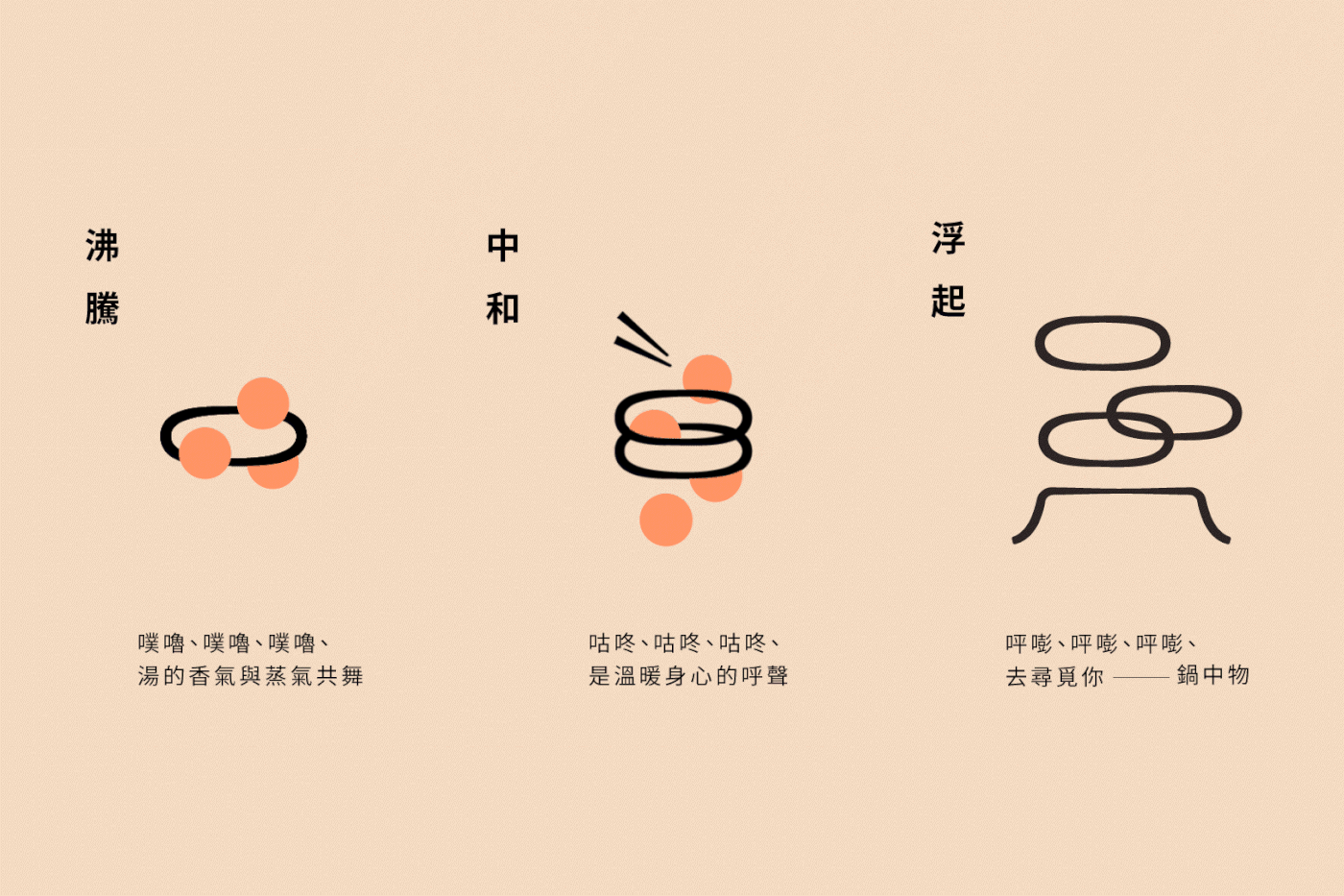
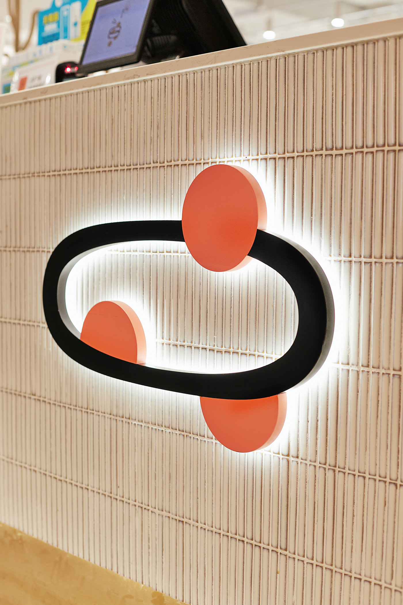
The “O” character reminds customers of the bubbling hotpot makes when the raw ingredients are dropped into the savoury boiling hot broth. Along with the hearing stimulation comes the distinct aroma of hotpot, which is also captured in the “O” character that is similar to the water vapour steaming from that pot of flavours.


TOPPOT– Hot Pot Shop
BRANDING DESIGN
TOPPOT 一鼎, a Taiwanese hotpot restaurant that markets one-pot-for-one, wants customers to be able to create and enjoy their own individualised hot pot broth and be able to share their distinct flavours with their dear ones in a comfortable and sanitary setting.
Design Solution
VINCDESIGN imbued TOPPOT’s logo design with various sensations present when having a hotpot. Visually, the “O” in TOPPOT is drawn to resemble the opening of the pot. To excite the hearing sensation of having a hotpot, the “O” character reminds customers of the bubbling hotpot makes when the raw ingredients are dropped into the savoury boiling hot broth. Along with the hearing stimulation comes the distinct aroma of hotpot, which is also captured in the “O” character that is similar to the water vapour steaming from that pot of flavours. Therefore, with merely the logo design of TOPPOT, customers are already brought to the mouth-watering sensations of indulging in TOPPOT in their land of imagination.
VINCDESIGN imbued TOPPOT’s logo design with various sensations present when having a hotpot. Visually, the “O” in TOPPOT is drawn to resemble the opening of the pot. To excite the hearing sensation of having a hotpot, the “O” character reminds customers of the bubbling hotpot makes when the raw ingredients are dropped into the savoury boiling hot broth. Along with the hearing stimulation comes the distinct aroma of hotpot, which is also captured in the “O” character that is similar to the water vapour steaming from that pot of flavours. Therefore, with merely the logo design of TOPPOT, customers are already brought to the mouth-watering sensations of indulging in TOPPOT in their land of imagination.
Furthermore, the design of the Chinese characters 一鼎 referenced ancient Chinese calligraphy. VINCDESIGN simplified the strokes in “鼎” to illustrate two chairs, and with the character “目” in between to represent the pots, the design becomes a pictogram that depicts the scene of people enjoying their hotpots together. Overall, the logo designs of TOPPOT 一鼎 by VINCDESIGN give the brand an image of cheerfulness, liveliness, and warmth.
Branding design for TOPPOT
Client/Project: TOPPOT
Creative Director: Vince Cheung
Design and illustration: Catherine Yuen
Character illustration: Janet Cheng @VVeBrand
Interior design: Beanspoke Interior Design Ltd
Client/Project: TOPPOT
Creative Director: Vince Cheung
Design and illustration: Catherine Yuen
Character illustration: Janet Cheng @VVeBrand
Interior design: Beanspoke Interior Design Ltd
Photography: Visala Wong @VIZION CREATION
商標 | 品牌設計 | 香港 | 香港設計 | 視覺形象 | 包裝 | 包裝設計
logo | branding | design | hong kong | hong kong designer | VI | visual identity | vincdesign | package | package design
logo | branding | design | hong kong | hong kong designer | VI | visual identity | vincdesign | package | package design


